Problem Statement
Hypothesis:
Some ethnic groups have been stopped at rates not justified by either their arrest rate or their location (as measured by precinct).
Data
Gelman and Hill have data on police stops in New York City in 1998–1999, during Giuliani’s mayoralty.
Data is available at this link.
Noise added for confidentiality. The first few rows of this file are a description.
frisk =read.table("http://www.stat.columbia.edu/~gelman/arm/examples/police/frisk_with_noise.dat",skip =6,header =TRUE)
nrow(frisk)

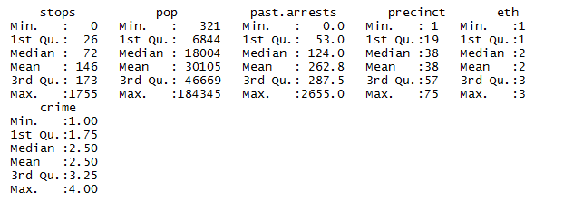
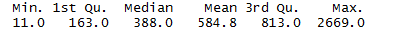
Let’s see the summary statistics
summary(frisk)
Counts of police stops for all combinations based on:
- 75 precincts
- 3 ethnicities of the person stopped(1 = black, 2 = Hispanic, 3 = white)
- 4 types of crime (violent, weapons, property, anddrug)
Total of 75×3×4 = 900rows.
Other variables:
- population of the ethnic group within the precinct
- the number of arrests of people in that ethnic group in that precinct for that type of crime in 1997.
For simplicity, ignore the type of crime, and aggregate the number of stops and past arrests overall four types.
frisk.sum =aggregate(cbind(past.arrests, stops) ~ precinct + eth, sum,data =frisk)
nrow(frisk.sum)

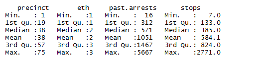
Lets have a look at summary statistics
summary(frisk.sum)
Dataframe for modeling
head(frisk.sum)
nrow(frisk.sum)
num of rows:225 (75precincts x 3 ethnic groups)
Ploting stops counts vs ethnic group
#install.packages('ggplot2')
library(ggplot2)
ggplot(frisk.sum,aes(x =stops,
                     color =factor(eth),
                     fill =factor(eth))) +
  geom_histogram(breaks =seq(0,2800,50)) +
  facet_wrap(~eth,ncol =1)
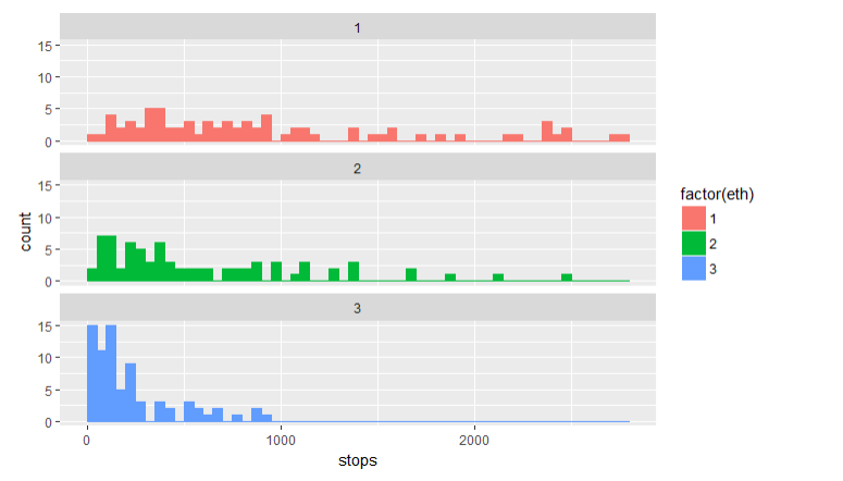
Findings
- The distributions of stops for black and Hispanic people are very different from the distribution for white people though there may be multiple explanations for this.
Let’s look at the relationship of stops with past arrests. Because of skewness, we log both variables. Also adding smoother for three groups
ggplot(frisk.sum,aes(x =log(past.arrests),
                     y =log(stops),
                     color =factor(eth))) +
  geom_point()+
  geom_smooth(method.args =list(degree =1))
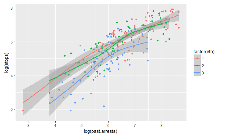
Findings
- There’s certainly a relationship.
- But is the relationship between the two variables is sufficient to explain the differences between the stops of the three ethnic groups?
Lets build a model for more insights and supporting facts.
As we have counts data, lets use Poisson Regression.
Poisson regression is another form of GLM. \ In a standard Poisson regression, the response has a Poisson distribution with the log of the expected value given by a linear function of the predictors.
In the single-variable case:
log(E[Y|x]) = Beta0+Beta1x
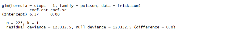
constant.glm =glm(stops ~1,family =poisson,data =frisk.sum)
#install.packages('arm')
library(arm)
display(constant.glm)

Coefficent estimate(on the log scale)=6.37
e^(6.37) = 584 on the original scale.
That is, the number of stops for each ethnic group within each precinct is modeled as a random variable with distribution Poisson(584)
(residual)deviance \ Low deviance is good, as long as you’re not overfitting. In particular, every time you add a degree of freedom, you should expect reduce the deviance by 1 if you’re just adding random noise. So if you’re not overfitting when you fit a complex model, you should expect to reduce the deviance by more than you increase the degrees of freedom. Now this model is obviously wrong. We might, for example, think that the number of stops for an ethnic groups in a precinct should be proportional to the number of arrests for that ethnicity-precinct (though this is controversial.)
In a GLM, we can model this using an offset:
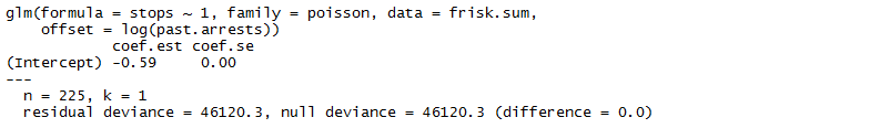
offset.glm =glm(stops ~1,family =poisson,
                offset =log(past.arrests),
                data=frisk.sum)
display(offset.glm)
As linear predictor is on the log scale, the offset also has to be logged.
Model
log[E(stops|st arrests)] =−0.59 + log(past arrests)
or (taking the exponential of both sides)
E[stops|past arrests] =e^{−0.59}+log(past arrests)= 0.56 × past arrests
The deviance of this model is much lower than the constant model, so lot of improvement in the fit.
Lets add ethnic group as a predictor. Ethnic group is categorical, so using it as a factor.
eth.glm =glm(stops ~factor(eth),family =poisson,
             offset =log(past.arrests),
             data =frisk.sum)
display(eth.glm)
The deviance has dropped substantially again.
New Model
E(stops) = multiplier for ethnic group × past arrests
where the multipliers for black, Hispanic, and white respectively are:
eth.co =coefficients(eth.glm)
multipliers =exp(c(eth.co[1], eth.co[1] + eth.co[2], eth.co[1] + eth.co[3]))
print(multipliers)
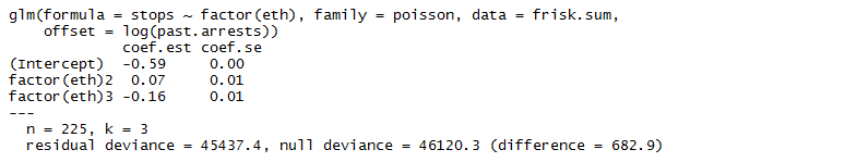
So far we have seen that black and Hispanic people were stopped at a proportionately higher fraction of their arrest rate compared to white people.
However, as the data isn’t from a randomized experiment, there may be confounding.\ For example, black and Hispanic people generally live in precincts with higher stop rates. (Whether this is in itself evidence of bias is again, controversial.)
Since this is exploratory work, we won’t attempt to prove cause-and-effect, but we’ll see what happens if we include precinct as an explanatory variable.
precinct.glm =glm(stops ~factor(eth) +factor(precinct),
                  family =poisson,offset =log(past.arrests),
                  data =frisk.sum)
deviance(eth.glm)

first few coefficients (and their standard errors):
coefficients(summary(precinct.glm))[1:6,1:2]

After controlling for precinct, the differences between the white and minority coefficients becomes evenbigger.
Checking the model
Plot of the residuals against the fitted values on the response (original) scale
precinct.fitted =fitted.values(precinct.glm)
precinct.resid =residuals(precinct.glm,type ="response")
precinct.glm.df =data.frame(frisk.sum,.fitted =precinct.fitted,.resid =precinct.resid)
ggplot(precinct.glm.df,aes(x =.fitted,y =.resid)) +
  geom_point() +
  geom_smooth(span =1,method.args =list(degree =1))
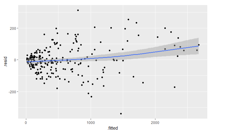
Findings
- The smoother isn’t flat maybe because of residual heteroskedasticity(spread out randomly).
- The heteroskedasticity is not a bug: Poissons are supposed to be heteroskedastic. Poisson(λ)random variable has variance $\lambda$ and standard deviation $\sqrt{\lambda}$. So the typical size of the residuals should go up as the square root of the fitted value.
- To remove this effect, lets create standardized residuals by dividing the raw residuals by the square root of the fitted value.
Plot of standardized residuals against the log fitted values to reduce the distortions causedby skewness.
precinct.std.resid = precinct.resid/sqrt(precinct.fitted)
precinct.glm.df$.std.resid = precinct.std.resid
ggplot(precinct.glm.df,aes(x =log(.fitted),y =.std.resid)) +
  geom_point() +
  geom_smooth(span =1,method.args =list(degree =1))
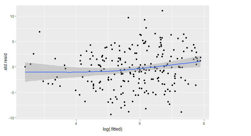
This is better, though far from perfect. There’s still some nonlinearity left in the smoother, though the amount is relatively small. If prediction was the goal, a nonparametric model would probably provide an improvement.
Dispersion Phenomenon
If the Poisson model were correct, the standardized residuals should be on a similar scale to the standard normal– that is, the vast majority should be within ±2. From the previous graph, that’s clearly not the case.
Measuring the overdispersion in the data. It can be done by two methods;
- Chi-squared test for overdispersion
- Calclate typical size of the squared residuals[should be close to 1]
Following second approach,
If the Poisson model is correct, this should be close to 1
overdispersion =sum(precinct.std.resid^2)/df.residual(precinct.glm)
overdispersion

This is much more than 1. In fact, this happens most of the time with count data – the data is usually more dispersed than the Poisson model.
How bad it is?
There are problems with above model. But are they so bad that we can’t draw conclusions from it?
Lets simulate a fake set of data, and see if it closely resembles the actual set.\ Each observation is a realization of a Poisson random variable with lambda given by fitted value.
sim1 =rpois(nrow(frisk.sum),lambda =fitted.values(precinct.glm))
summary(frisk.sum$stops)
summary(sim1)
sim.df =data.frame(frisk.sum, sim1)
#install.packages('tidyr')
library(tidyr) # for gather
sim.long = sim.df %>%gather(type, number, stops:sim1)
ggplot(sim.long,aes(x =number)) +
  geom_histogram(breaks =seq(0,2800,50)) +
  facet_wrap(~type,ncol =1)

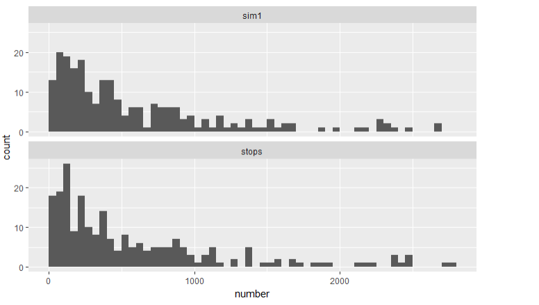
If we look at the histograms, there doesn’t seem to be much difference. But what happens if we fit a model to the simulated data and look at its residuals?
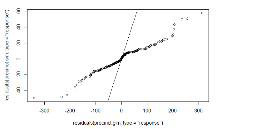
We’ll find residuals and do a two-sample QQ plot of them against the original residuals.
precinct.sim =glm(sim1 ~factor(eth) +factor(precinct),
                  family =poisson,offset =log(past.arrests),
                  data =sim.df)
qqplot(residuals(precinct.glm,type ="response"),
       residuals(precinct.sim,type ="response"))
abline(0,1)

If the model were correct, this QQ plot should be close to a line through the origin with slope 1. It ain’t.
The simulation here is overkill.
Fixing overdispersion
Using the quasipoisson family instead of the Poisson.
precinct.quasi =glm(stops ~factor(eth) +factor(precinct),
                    family =quasipoisson,offset =log(past.arrests),
                    data =frisk.sum)
coefficients(summary(precinct.quasi))[1:6,1:2]
Note:\
- coefficients look the same as they were in the standard Poisson case.
- standard errors have been inflated by the square root of their overdispersion.
- fitted values haven’t changed
quasi.fitted =fitted.values(precinct.quasi)
summary(quasi.fitted - precinct.fitted)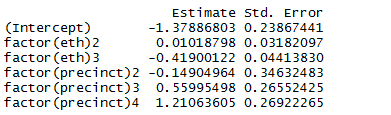
For interpretation, it may be useful to refit the model changing the order of levels inethto use whites as a baseline.
precinct.quasi2 =glm(stops ~factor(eth,levels =c(3,1,2)) +factor(precinct),
                     family =quasipoisson,offset =log(past.arrests),
                     data =frisk.sum)
coefficients(summary(precinct.quasi2))[1:6,1:2]

We now back-transform to get intervals for the stop rates of blacks and Hispanics relative to whites, after adjusting for arrest rates and precinct.
eth.co =coefficients(summary(precinct.quasi2))[1:3,1:2]
ethnicity =c("Black","Hispanic")
estimate =exp(eth.co[2:3,1])
lower =exp(eth.co[2:3,1] -2* eth.co[2:3,2])
upper =exp(eth.co[2:3,1] +2* eth.co[2:3,2])
eth.co.df =data.frame(ethnicity, estimate, lower, upper)
ggplot(eth.co.df,aes(x =ethnicity,y =estimate,ymin =lower,ymax =upper)) +
  geom_pointrange() +ylim(1,2) +geom_abline(intercept =1,slope =0,color ="red") +
  ylab("Ratio of stop rate to that of whites, adjusted for past arrests and precinct") +
  ggtitle("Approximate 95% confidence intervals for NYPD stop rates of minorities") +
  coord_flip()
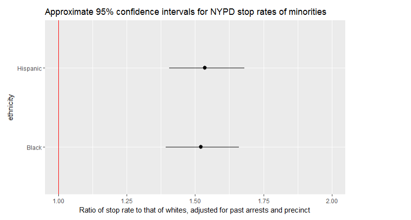
Conclusion
The confidence intervals don’t include 1. This would be consistent with a hypothesis of bias against minorities,though we should think very carefully about other confounding variables before drawing a firm conclusion(e.g. type of crime, which we ignored.)
Future work
Implement alternative approaches:
- Negative binomial regression : alternative to the quasipoisson when the count data is overdispersed.
- Nonparametric approaches like loess and GAM can give better fit for the conditional expectation, at the cost of making inference much more complicated.
- A multilevel model : because of the large number of precincts. Can overcome overdispersion as well as regularize the estimates for the precincts.
Footnotes General:
- display() function in package arm - For individual summary statistics
- use rpois() to do simulation for fake data generation ggplot2 package functions:
- ggplot()
- geom_histogram()
- facet_warp()
- geom_point()
- geom_abline()
- geom_pointrange() ‘add one standard error bounds’
- geom_smooth() ‘curve fitting’ tidyr package function:
- gather ‘used for creating long dataframe’ GLM function:
- family =poisson
- family =quasipoisson
- offset