Libraries Required
library(ggplot2)
library(MASS)
library(GGally)
library(agridat)
library(broom)
library(tidyr)
library(gridExtra)
Data Import
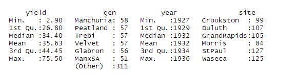
Lets import the data and have a look at summary of it.
data=agridat::minnesota.barley.yield
summary(data)
Plots for barley yields varied by gen(variety) and year at each site
ggplot(data=data, aes(x=year, y = yield ,colour = gen, group= gen)) +geom_line()+ geom_point() + facet_wrap(~site)+ ggtitle("Barley yield vs year ~ Site for all varieties")
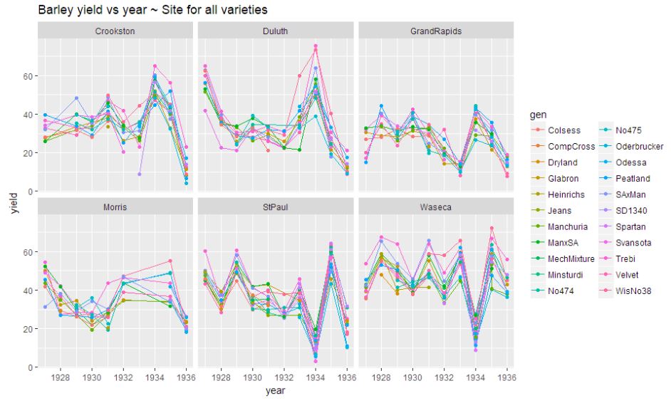
There is no pattern in above plot. Sites StPaul, Duluth and are showing some extreme skewness.There has been a decrease of yield during 1935-36. The pattern remains irregular.
Pattern Exploration for yield at diff sites and time
Consider the mean yields (average over all the varieties) in each year at each site.
data.avg=aggregate(yield~year+site,mean,data=data)
#Facet plot for mean yeild at each site against year-timeline
p1<-ggplot(data=data.avg, aes(x=year, y = yield ,colour = site, group =site)) +
  geom_line()+facet_wrap(~site)+geom_point() + ggtitle("Barley yield vs year ~ Site")
#integrated graph showing general trend in mean yield at each site over years
p2<-ggplot(data=data.avg, aes(x=year, y = yield ,colour = site, group =site)) +
  geom_line()+geom_point() + ggtitle("Barley yield vs year ~ Site")
grid.arrange(p1,p2,nrow=2)
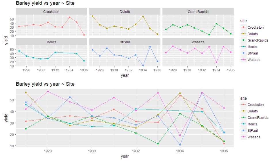
Looking at the graph, it is difficult to comment on the pattern of barley yield per year with respect to the location. On an average compared to the yield for any location during 1927, there has been a decrease of yield during 1935-36. The pattern remains irregular, it is more common for the yields to increase at some locations and decrease at others.
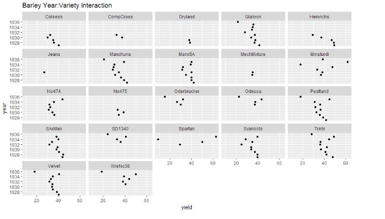
Interaction among the variables
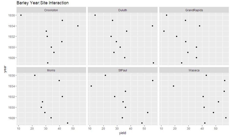
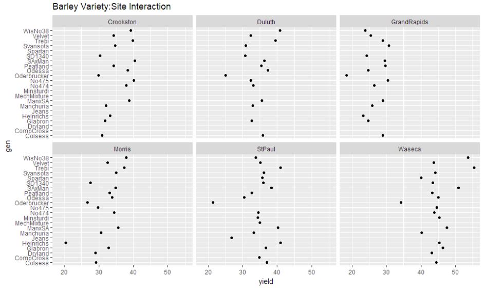
let’s plot the graph of their interactions and check which is relatively highly scattered i.e. if the year and variety variation here is small (i.e. in each panel dots are scattered close to vertical line), then perhaps we can do without such interactions.
year.gen <- aggregate(yield ~ year + gen, mean, data = data )
year.site <- aggregate(yield ~ year + site, mean, data = data )
gen.site <- aggregate(yield ~ gen + site, mean, data = data )

ggplot(year.gen, aes(x = yield, y = year)) + geom_point(size=1.5) + facet_wrap(~ gen) + ggtitle("Barley Year:Variety Interaction")
ggplot(year.site, aes(x = yield, y = year)) + geom_point(size=1.5) + facet_wrap(~ site) + ggtitle("Barley Year:Site Interaction")
ggplot(gen.site, aes(x = yield, y = gen)) + geom_point(size=1.5) + facet_wrap(~ site) + ggtitle("Barley Variety:Site Interaction")
We can observe that the year:site interaction graph shows the dots to be reasonably spaced out, thus indicating interaction required to be considered.
Model Selection
As the data consist of outliers and considering interaction also, least squares will be potentially misleading, I choose an outlier-resistant alternative i.e rlm() with bisquare to minimize the impact.
Model Implementation
Applying RLM Model,with the goal of determining whether Morris 1931-1932 is an anomaly.
barley.rlm = rlm(yield ~ year * site + gen, psi = psi.bisquare, data = data)
barley.rlm.df = augment(barley.rlm)
barley.3132 <- barley.rlm.df[barley.rlm.df$year == 1931 | barley.rlm.df$year == 1932,]
barley.3132$year = factor(barley.3132$year)
Plot to show the site effects
site.effects = sort(dummy.coef(barley.rlm)$site)
sites = factor(names(site.effects), levels = names(site.effects))
site.df = data.frame(effect = site.effects, site = sites)
ggplot(site.df, aes(x = effect, y = site, color = site)) + geom_point()
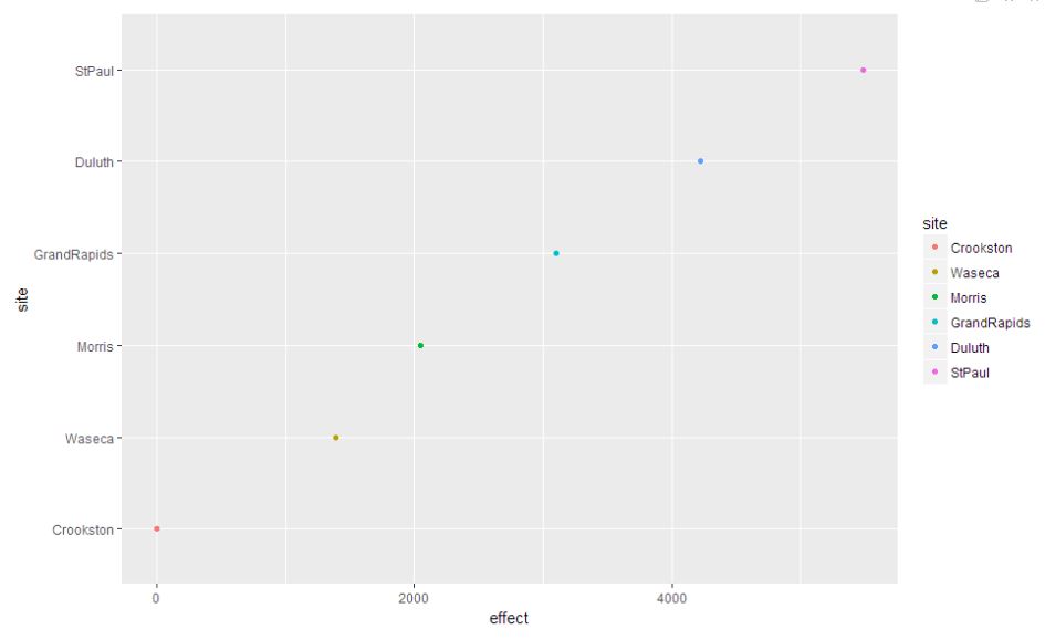
As we can see StPaul has the highest site effect where Crookston has the lowest effect. The other four approximately equally spaced from each other.
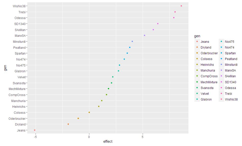
Plot to show the variety (gen) effects.
gen.effects = sort(dummy.coef(barley.rlm)$gen)
gens = factor(names(gen.effects), levels = names(gen.effects))
gens.df = data.frame(effect = gen.effects , gen = gens)
ggplot(gens.df, aes(x = effect, y = gen, color = gen)) + geom_point()
Residual and Fitted Values plot for anomaly detection
ggplot(barley.3132, aes(y=gen,x=.fitted,color=year)) + geom_point() + facet_wrap(~ site)+ ggtitle("Fitted Plot for year 1931-32 of the Barley yield wrt Site ")
ggplot(barley.3132, aes(y=gen,x=.resid,color=year)) + geom_point() + facet_wrap(~ site)+ ggtitle("Residual Plot for year 1931-32 of the Barley yield wrt Site ")
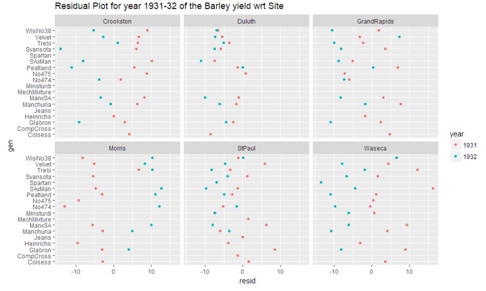
After proceeding with the RLM to model the data, it is evident from the residual plot that Morris during the year 1931-32 appears as an anomaly. The plot indicates a general trend in the residuals across all sites that 1931 appears to be on the positive end and 1932 appears to be on the negative end. But, Morris seems to defy the trend. Thus exhibiting an anomaly.
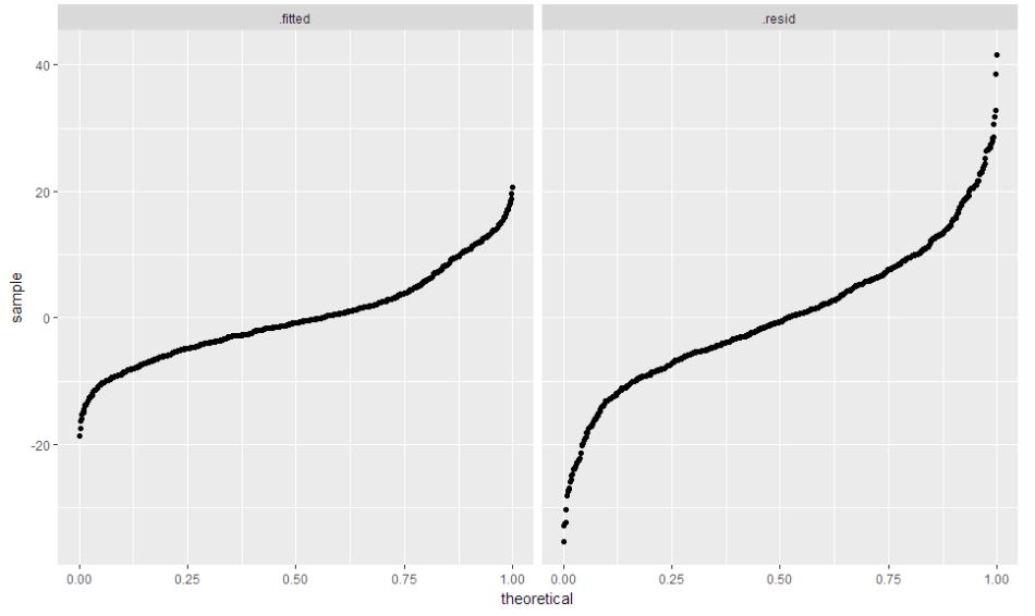
barley.rlm = rlm(yield ~ gen + year + site, psi = psi.bisquare, data = data)
barley.rlm.df = augment(barley.rlm)
barley.rlm.df$.fitted = barley.rlm.df$.fitted - mean(barley.rlm.df$.fitted)
barley.rlm.long = barley.rlm.df %>% gather(component, value, c(.fitted, .resid))
ggplot(barley.rlm.long, aes(sample = value)) + stat_qq(distribution = "qunif") +
facet_grid(~component)
- Thus from above plots it is evident that Morris fails to follow the pattern of Barley yield that is exhibited across all sites.
- But, this should not be treated as an anomaly. Morris could have been under the influence of some sort of famine during 1931, to address the low barley yield issue.
- The yield vs year ~ Site from Question:1 clearly states that there was no pattern observed over the years in the Barley yield across sites.
- The ~650 Observations are convincing to believe that the Morris 1931-32 data should not be considered as a mistake.
Thus, the yield for Morris should be considered as a natural variation.