For the study of Logistic Regression and Weighted Regression we will be using ANES Time Series Cumulative Data, containing election data from 1948 to 2012.\
Download Data from this link
The data is very messy. Let’s read the STATA file using rio library(useful for exotic data formats)
library(rio)
ANES=import("anes_timeseries_cdf.dta")
SNEAK PEAK at data
head(ANES)
What do we care about? Lets explore ‘income’ which is ‘VCF0114’ as per the [codebook].
income = ANES$VCF0114
summary(income)
Levels for Income [1 to 5]: where the number represents below ranges 1: 0 to 16 percentile 2: 17 to 33 percentile 3: 34 to 67 percentile 4: 68 to 95 percentile 5: 96 to 100 percentile
It has zeroes and also NA’s which are missing values.\ This is an ordinal variable but we might find some advantages in treating it as quantitative.\ Using year [VCF0004] for each observation.
year = ANES$VCF0004
summary(year)
Lets use the binary variable vote which is [VCF0704a] provides two-party Presidential vote.\ Here, we will consider votes for the third-parties or who didn’t vote are treated as missing values.
vote = ANES$VCF0704a
summary(vote)
Convention: “1” means the Democrat “2” means the Republican “0” or “NA” means some other outcome
We want everything to be coded as 0, 1, or NA. Therefore, changing the zeroes to NA’s:
vote[vote==0]=NA
summary(vote)
Subtract 1 from vote to make “0” and “1” categories
vote = vote-1
summary(vote)
Renaming the vote variable to Republican as now the variable represent a two-party vote for Republicans
Republican = vote
Let’s consider another variable survey.weights for our model
survey.weights = ANES$VCF0009z
summary(survey.weights)
Dataframe for Modeling
ANES.df =data.frame(year, income, Republican,survey.weights)
summary(ANES.df)
Bush against Bill Clinton Lets see the statitics of 1992 election
ANES1992 =subset(ANES.df, year ==1992)
summary(ANES1992)
#Counts for votes
summary(factor(ANES1992$Republican))
What’s the relation between income and vote?
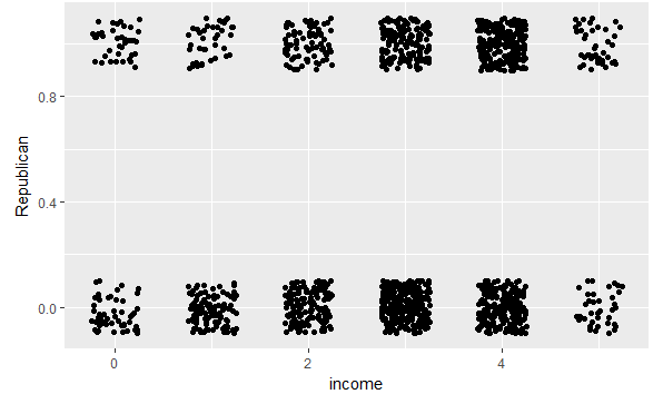
Plotting the scatterplot with including jitter as there are less levels and binary response variable
library(ggplot2)
ggplot(ANES1992,aes(x =income,y =Republican)) +
  geom_jitter(height =0.1,width =0.25)
Lets look at quantitative summary:
aggregate(Republican ~ income, mean,data =ANES1992)
This gives the proportion (out of major party voters) who voted for Bush for each income group. Aside from group zero, which represents missing values of income, we see a strictly increasing pattern. This suggests that logistic regression might work well on the data.
Fitting logistic regression using income as a quantitative variable and omitting missing values. Logistic regression is a special case of a GLM, so lets use the glm()function.
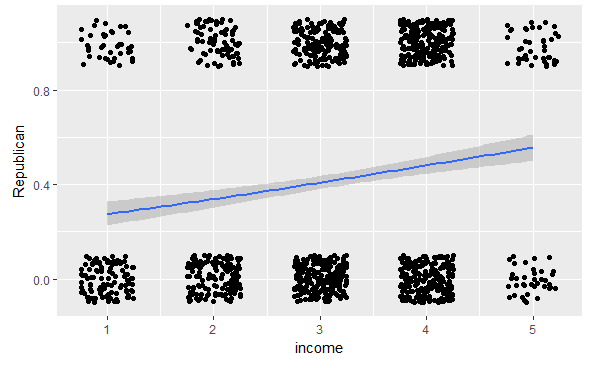
Fitted value curve:
ANES1992 =subset(ANES1992, income >0)
ggplot(ANES1992,aes(x =income,y =Republican)) +
  geom_jitter(height =0.1,width =0.25) +
  geom_smooth(method ="glm",method.args =list(family ="binomial"))
We can also fit it explicitly:
Bush.logit =glm(Republican ~ income,family =binomial,data=ANES1992)
summary(Bush.logit)
Summary Insights:
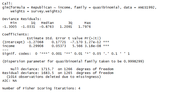
logit[P(Bush)]= −1:27 + 0.298 × income
where,
logit(x)=$\log_e \frac{x}{1-x}$
To find P(Bush),inverting the logit:
$P(Bush)= \frac{e^y}{1+e^y}$ where,
y=logit[P(Bush)]
“divide by 4” rule \ The maximum change in probability associated with a one unit change in x is the coefficient of x divided by four. For each income group change the model probability changes by up to about 7.5%.\ Consider income group 4 to group 5.
library(boot)
inv.logit(-1.27+0.298*4)
inv.logit(-1.27+0.298*5)
Weighted Regression
The modern survey results are rarely a true simple random sample from the population. To adjust for groups being underrepresents or overrepresented in a sample,surveys results are weighted.
The ANES variable VCF0009z contains weights to make the sample resemble the demographics of the Current Population Survey.
Technically once we have weights we’re no longer fitting a binomial, so using \ family = quasibinomial
Bush.weighted.logit =glm(Republican ~ income,family =quasibinomial,
                         weights =survey.weights,data =ANES1992)
summary(Bush.weighted.logit)
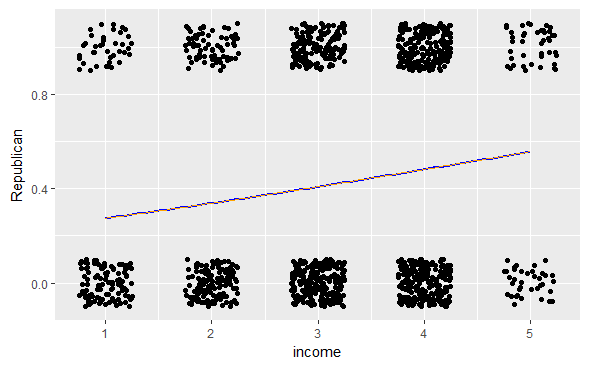
Unweighted and weighted fits
our.logit = function(x) {
  coe =coef(Bush.weighted.logit)
  y = coe[1] + coe[2] * x
  return(exp(y)/(1+exp(y)))
}

ggplot(ANES1992,aes(x =income,y =Republican)) +
  geom_jitter(height =0.1,width =0.25) +
  geom_smooth(method ="glm",method.args =list(family ="binomial"),se =FALSE,color ="blue") +
  stat_function(fun =our.logit,color ="orange")
The weighted and unweighted fits are nearly indistinguishable. This is quite often the case when creating regression models.
Fitting a series of regressions
Problem Statements:
- Is the relationship similar between income and vote for every Presidential election? OR
- Some elections are different?
- Has there been a consistent change over time?
Function to fit weighted logistic regression of vote on income for any given year.
logit.ANES.subset = function(my.year, data){
  newdata =subset(data, year == my.year)
  newdata =subset(newdata, income >0)
  model =glm(Republican ~ income,family =quasibinomial,
             weights =survey.weights,data =newdata)
  output =c(my.year,summary(model)$coef[2,1:2])
  return(output)
}
Function testing for year 1992 Bush-Clinton election:
logit.ANES.subset(my.year =1992,data =ANES.df)
The “estimate” is the same as the weighted regression. Let’s apply for every Presidential Election from 1948 - 2012
years =seq(1948,2012,4)
n =length(years)
income.by.year =data.frame(year =rep(NA, n),
                           income.coef =rep(NA, n),
                           income.se =rep(NA,n))
for (J in 1:n){
  my.year = years[J]
  income.by.year[J, ] =logit.ANES.subset(my.year =my.year,data =ANES.df)
}
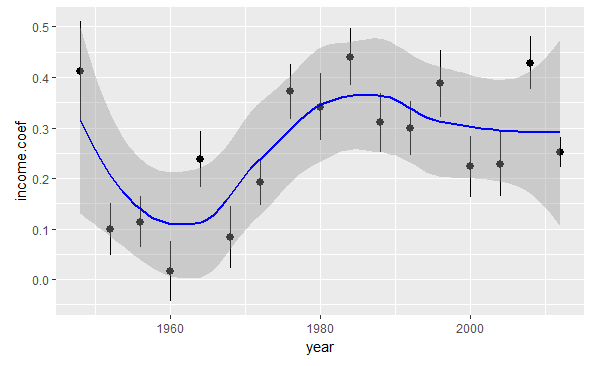
Time-series plot of income.coef against year
ggplot(income.by.year,aes(x =year,y =income.coef,
                          ymin =income.coef - income.se,
                          ymax =income.coef + income.se))+   geom_pointrange()+ geom_smooth(method.args =list(family ="symmetric"), se =TRUE,color ="blue")
Findings:
- The income coefficient is positive for every election, meaning richer people were more likely to vote Republicanevery time (though 1960 was close.)
- The general trend was an increase in the income coefficient from 1952 to 1984, then a leveling-off.
- There was a huge drop from 1948 to 1952; unfortunately we don’t have data from before 1948 to know if the election was typical.
- Otherwise there are a couple of elections outside the confidence band: 1964 (Johnson over Goldwater) and 2008 (Obama over McCain).
Treating income as factor and tracking the weighted proportion of each income group that (two-party) voted Republican by year.
library(dplyr)
summarise(group_by(ANES1992, income),
          weighted.mean(Republican,w =survey.weights,na.rm =TRUE))
Dropping “0” income category and subsetting data for each year.
n =length(years)
income.prop.by.year =data.frame(year =rep(NA, n),
                                income1 =rep(NA, n),
                                income2 =rep(NA,n),
                                income3 =rep(NA, n),
                                income4 =rep(NA, n),
                                income5 =rep(NA, n))
for (J in 1:n){
  my.year = years[J]
  ANES.my.year =subset(ANES.df, year == my.year & income >0)
  income.prop.by.year[J,1] = my.year
  income.summary =summarise(group_by(ANES.my.year,income),
                            weighted.mean(Republican,w =survey.weights,
                                          na.rm =TRUE))
  income.summary =as.data.frame(income.summary)
  income.prop.by.year[J,2:6] = income.summary[,2]
}
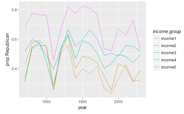
Plot of Republican_vote proportion timeline(year) for each income category
library(tidyr)
income.prop.long = income.prop.by.year %>%
  gather(income.group, prop.Republican,income1:income5)

ggplot(income.prop.long,
       aes(x =year,
           y =prop.Republican,
           group =income.group,
           color =income.group)) + geom_line()
Findings
- The top income group is reliably the most Republican, but the bottom income group varies in voting
- In 1948 there were pretty big differences between income groups, but in the 1950s the differences between all groups except the richest were small.
- There are two possibilities of aberration,
- Either 1948
- The small income differences from 1952 to 1968 were historical unusual
- The big coefficient for 1964 (compared to the elections before and after) might be in part an artifact of the logit scale.
- In 2008 there really was a big difference between income group, which is likely attributable to the financial crisis.
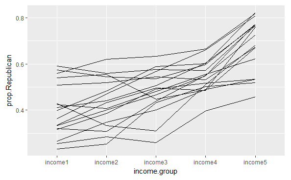
Connecting income groups by year
ggplot(income.prop.long,
       aes(x =income.group,
           y =prop.Republican,
           group =year)) +geom_line()
Footnotes:\ ggplot2 library functions used:\
- ggplot()
- geom_point()
- geom_line()
- geom_pointrange() ‘add one standard error bounds’
- geom_smooth() ‘curve fitting’
- geom_jitter() ‘less x(income_groups) and y(0,1) levels’ weights argument:
- weighted.mean() ‘used in conjunction with summarise() from ‘dplyr’. gather data:
- gather ‘used for creating long dataframe’


